Branding
Key Human Design
Key Human Design is a consultancy that puts people at the center, with a clear purpose: to empower individuals and organizations through collaboration, strategic design, and collective growth.
This identity project aims to visually translate that mission by building a logotype that balances humanity with structure, warmth with solidity. A brand designed to convey trust, vision, and transformative potential.

Concept
Ants. The Key Human Design logo comes from a thoughtful concept that reflects the heart of the consultancy’s mission: to empower people and organizations by embracing collaboration, strategic building capacity, and the power of collective insight.
Logotype
The main typography can be seen as an abstraction inspired by the silhouette of an ant, featuring a clear, contemporary, and stable typeface that reinforces the ideas of structure and trust: Fundamental qualities for a consultancy.
The slogan, placed beneath the main logotype, is set in a handwritten-style script font. This typographic contrast introduces a human and approachable touch that balances the formality of the primary typeface, creating a composition that feels both warm and expressive while maintaining visual strength.

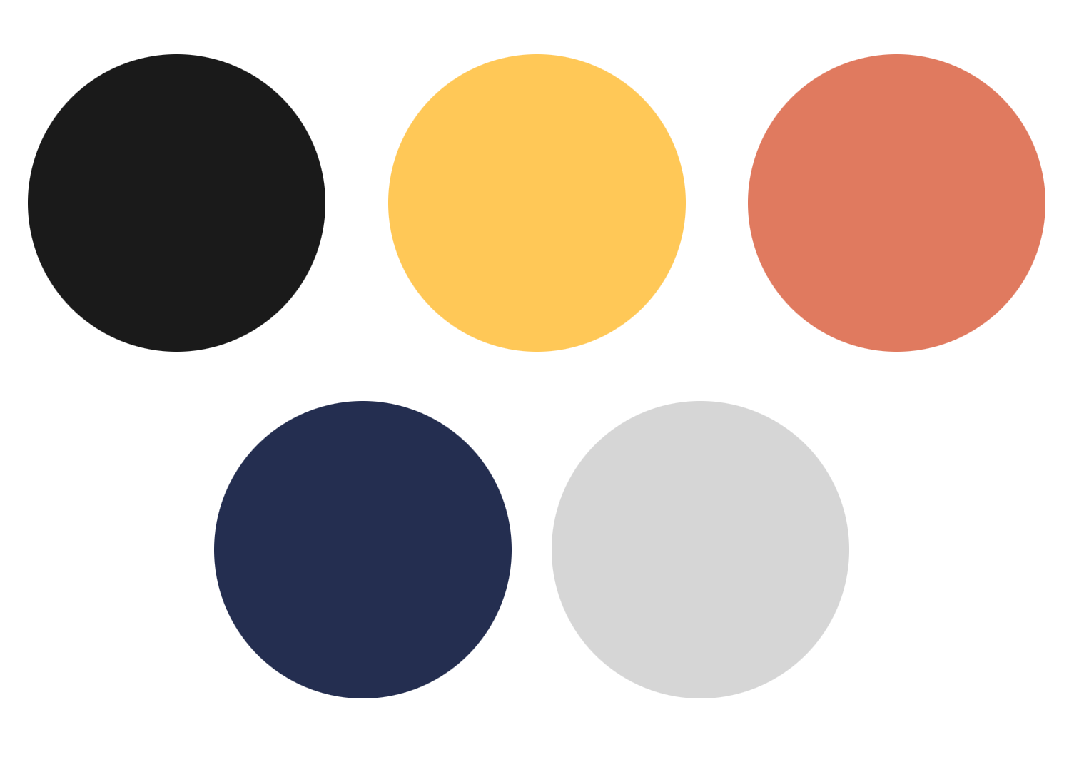
This color palette achieves its effect by blending warm, earthy tones with deep, sophisticated accents, creating a visual language that conveys collaboration, solidity, and strategic thinking, a chromatic harmony that reflects both the human-centered nature of the design and the collective intelligence that drives the project.
The isotype features an ant carrying a “leaf”, a small yet powerful image that celebrates the beauty of collaboration. It shows how tiny, purposeful actions come together to create meaningful progress. This symbol feels both grounded and dynamic, perfectly capturing the essence of teamwork and growth in a clean, memorable design.
Branding, Illustration 2022
Location: Remote: Barcelona-Chile
Graphic Design: Bárbara Fenzo
Client: Key Human Design Consultancy